WEB
WEB
WEB
REAL ESTATE
REAL ESTATE
REAL ESTATE
BRANDING
BRANDING
BRANDING
Chelsea Phillips
Chelsea Phillips
Chelsea Phillips
Real Estate Website Redesign
Real Estate Website Redesign
Real Estate Website Redesign
This project focuses on redesigning the Chelsea Phillips Realty website to enhance user experience, optimize property searches, and strengthen the brand’s digital presence. By refining the site's information architecture (IA), improving accessibility, and implementing a modern, user-friendly interface, we aim to create a platform that empowers buyers and sellers with confidence and clarity.
This project focuses on redesigning the Chelsea Phillips Realty website to enhance user experience, optimize property searches, and strengthen the brand’s digital presence. By refining the site's information architecture (IA), improving accessibility, and implementing a modern, user-friendly interface, we aim to create a platform that empowers buyers and sellers with confidence and clarity.
This project focuses on redesigning the Chelsea Phillips Realty website to enhance user experience, optimize property searches, and strengthen the brand’s digital presence. By refining the site's information architecture (IA), improving accessibility, and implementing a modern, user-friendly interface, we aim to create a platform that empowers buyers and sellers with confidence and clarity.
ROLE
Product Designer
Product Designer
Product Designer
TEAM
UX Designers
Project Manager
UX Designers
Project Manager
UX Designers
Project Manager
DURATION
10 Weeks
10 Weeks
10 Weeks
❌ What wasn’t working
❌ What wasn’t working
Users visited the site to make one of the most important decisions of their lives: choosing a home. But the old design made this process stressful instead of reassuring.
Users visited the site to make one of the most important decisions of their lives: choosing a home. But the old design made this process stressful instead of reassuring.
Didn’t feel trustworthy.
Outdated visuals and inconsistent data made users skeptical of the listings.
Outdated visuals and inconsistent data made users skeptical of the listings
Didn’t feel intuitive.
Property details were scattered across pages, and key information was hard to compare.
Property details were scattered across pages, and key information was hard to compare.
Didn’t feel premium.
The branding failed to communicate the client’s high-end, boutique positioning.
The branding failed to communicate the client’s high-end, boutique positioning.
FINAL PRODUCT
Brand Identity System
Brand Identity System
The redesigned brand identity elevates the client’s digital presence by creating an experience that feels premium, trustworthy, and emotionally warm. This system aligns the visual language with the expectations of modern home buyers—balancing credibility with approachability.
The redesigned brand identity elevates the client’s digital presence by creating an experience that feels premium, trustworthy, and emotionally warm. This system aligns the visual language with the expectations of modern home buyers—balancing credibility with approachability.


FINAL PRODUCT
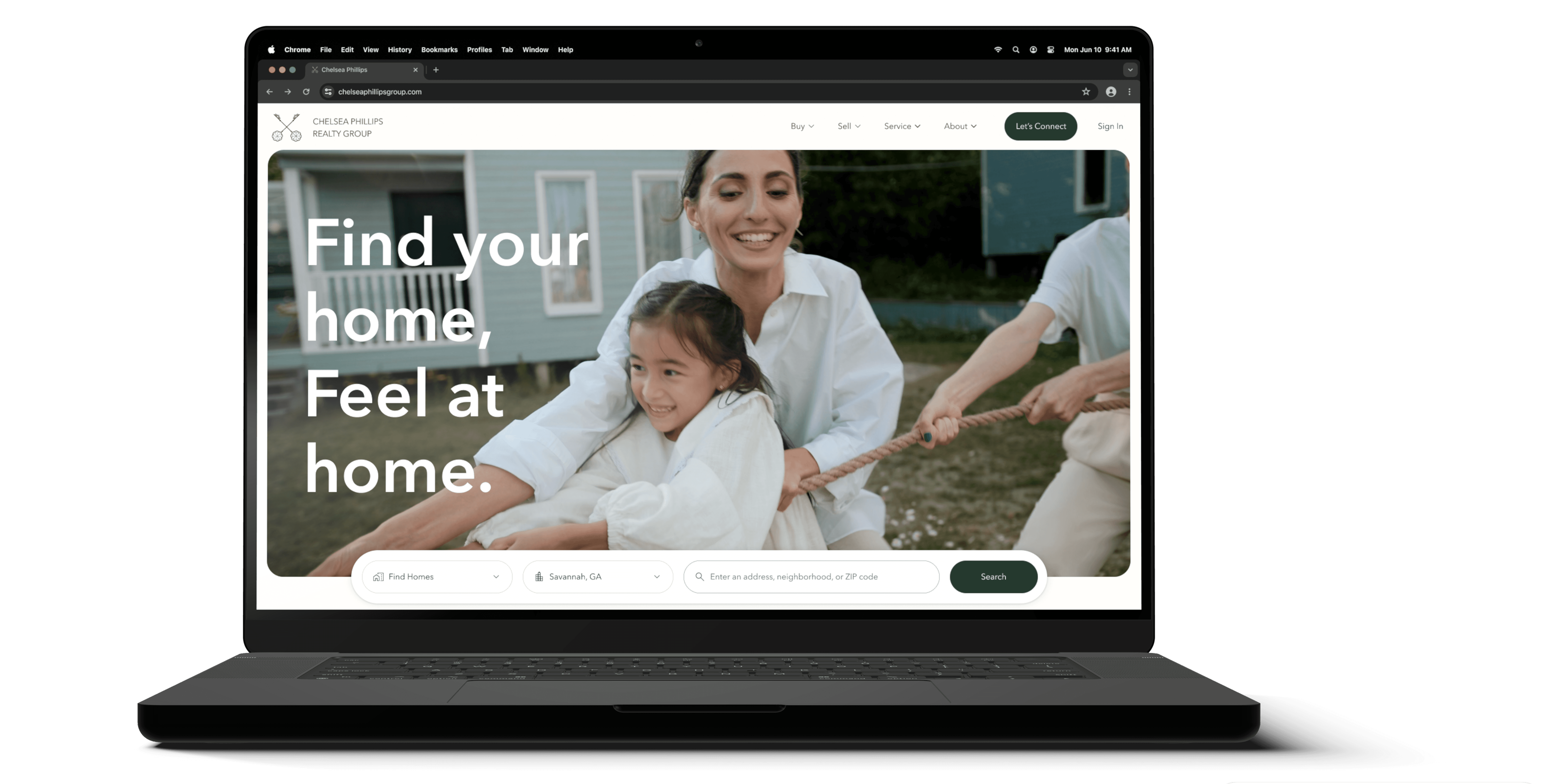
Hompage
Hompage
BEFORE
❌ Cluttered Layout & Poor Navigation
❌ Cluttered Layout & Poor Navigation
The original homepage lacked visual hierarchy, making it hard for users to locate the search bar, browse listings, or understand the site structure.
The original homepage lacked visual hierarchy, making it hard for users to locate the search bar, browse listings, or understand the site structure.


AFTER
✅ Clean, Warm, & Intuitive Experience
✅ Clean, Warm, & Intuitive Experience
The redesigned homepage focuses on emotional storytelling, clear search controls, and organized property highlights—helping users find what they need quickly and confidently.
The redesigned homepage focuses on emotional storytelling, clear search controls, and organized property highlights—helping users find what they need quickly and confidently.


FINAL PRODUCT
Listing page
Listing page
BEFORE
❌ Hard to Read & Lacking Structure
❌ Hard to Read & Lacking Structure
The page crowded images, tables, maps, and charts together with little spacing.
The page crowded images, tables, maps, and charts together with little spacing.
The page crowded images, tables, maps, and charts together with little spacing.


AFTER
✅ Structured for Clarity & Decision-Making
✅ Structured for Clarity & Decision-Making
The redesigned layout uses spacious sections, interactive tools, and emotion-driven imagery to help users understand the property and neighborhood more easily.
The redesigned layout uses spacious sections, interactive tools, and emotion-driven imagery to help users understand the property and neighborhood more easily.


FINAL PRODUCT
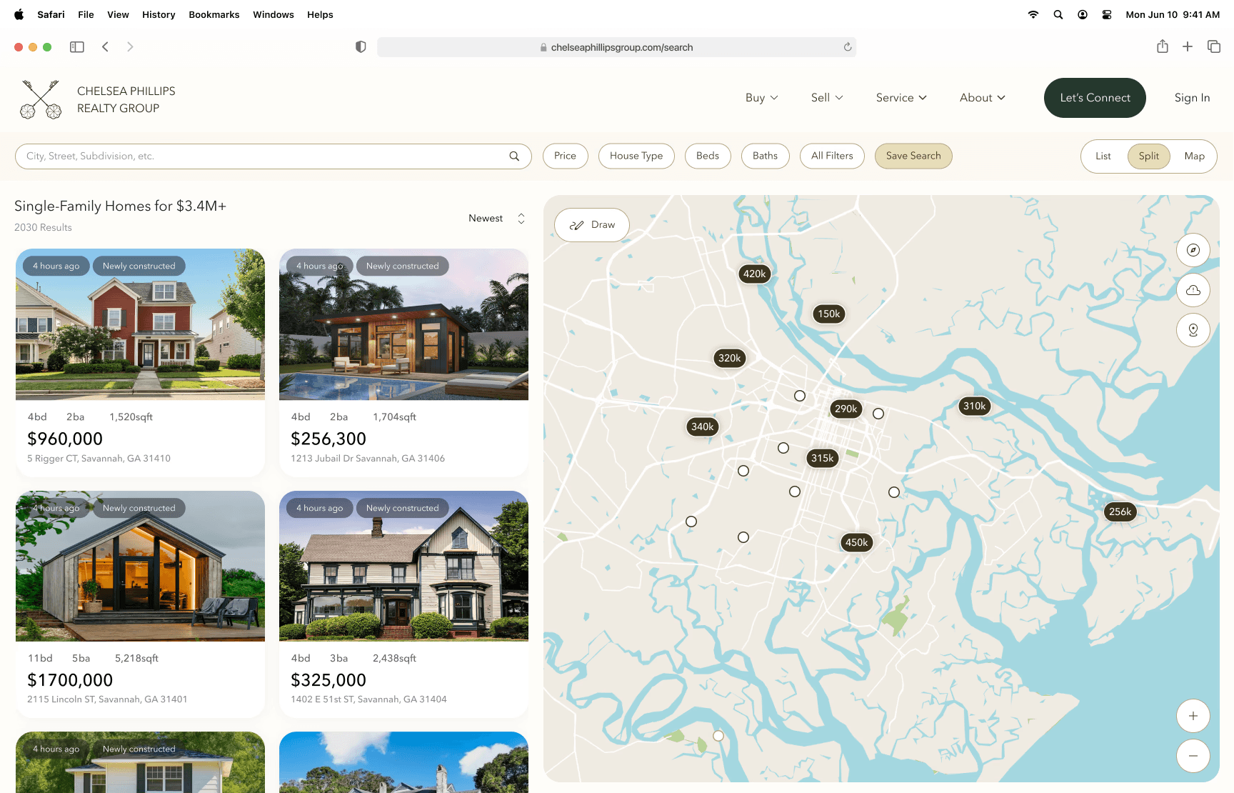
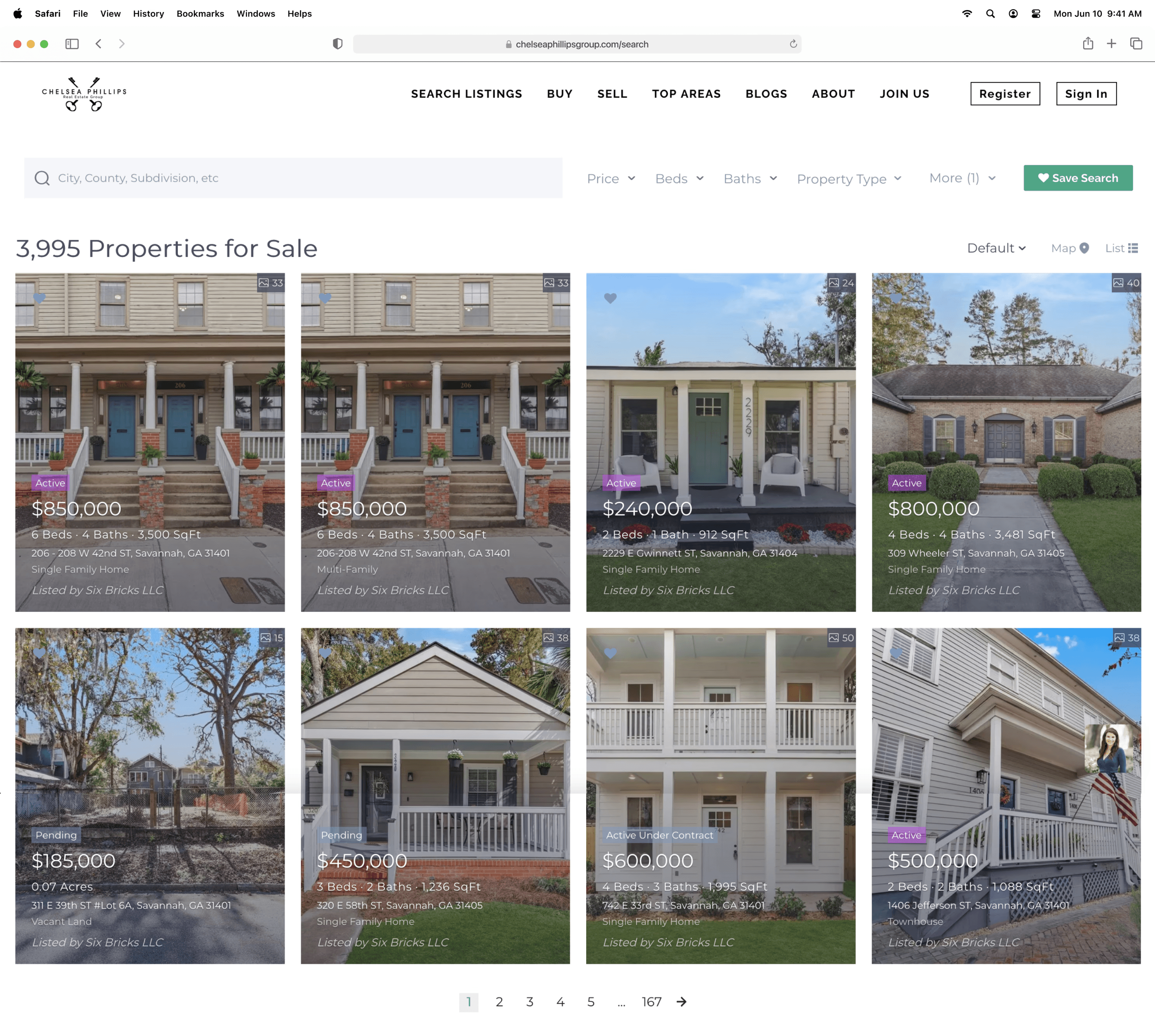
Result page
Result page
BEFORE
❌ Overwhelming Listing Grid
❌ Overwhelming Listing Grid
With too many listings packed tightly together and minimal differentiation, users often felt lost and unsure where to look first.
With too many listings packed tightly together and minimal differentiation, users often felt lost and unsure where to look first.
With too many listings packed tightly together and minimal differentiation, users often felt lost and unsure where to look first.
AFTER
✅ Organized, Visual, & Easy to Browse
✅ Organized, Visual, & Easy to Browse
The refreshed layout highlights key listing details, uses larger visuals, and introduces a clean two-pane map view for more efficient home discovery.
The refreshed layout highlights key listing details, uses larger visuals, and introduces a clean two-pane map view for more efficient home discovery.